
Journal — 11 October 2026
Newstalgia: The Interiors Trend Taking Us Out of Beige and Into 2027
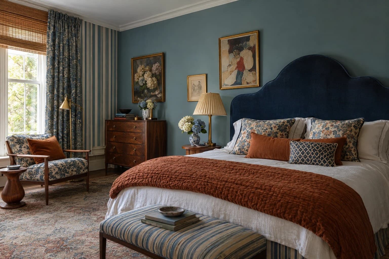
For the better part of a decade, the safest room in the house was the one nobody could argue with. Grey walls, white joinery, a bouclé sofa with no corners, everything new and everything matching. It photographed beautifully and it said very little. That is quietly coming to an end, and the thing replacing it has been given a name. Newstalgia.
What newstalgia actually means
It is a clumsy word for a lovely idea. Newstalgia is the pairing of the new with the remembered: a contemporary room that holds older pieces, softer colour and a little wear, so that it reads as something gathered over time rather than delivered in one van on one afternoon.
It is not a revival. Nobody is asking you to live in a reproduction of your grandmother’s house. The architecture stays current, the kitchen still works, the lighting is still good. What changes is the feeling. A room designed this way looks like it belongs to someone, and like it has been added to more than once.
The long goodbye to grey
Millennial grey was never really a colour choice. It was a way of not choosing. Grey and the lighter beiges offered a room that would offend nobody and resell easily, and for a while that felt like good sense. The cost was that an enormous number of homes started to look like one another.
Warm neutrals are not disappearing, and they should not. What is changing is their temperature and their depth. Mushroom, clay, taupe and cream are doing the work that cool grey used to do, and they are being allowed to carry some colour of their own rather than being drained of it.
Every year the big paint companies each name a colour of the year. It is worth paying attention to them, not because you should paint a room that exact colour, but because between them they tell you what everyone will be looking at. Three of the 2027 choices are out, and they are all saying the same thing.
Rose Earth
Graham & Brown
Grounded
Behr
Cottage Door
Valspar
A warm, grounded pink that sits far closer to clay than to blush. A deep olive somewhere between moss and khaki, with brown beneath it. A muted denim, washed a hundred times. What the three have in common is that none of them shouts. You could paint an entire room in any one of them and still have somewhere restful to sit. But each has a definite colour running through it, which is precisely what grey and beige were chosen to avoid. That is the shift. Not brighter. Warmer.
Chocolate, walnut and cognac
If there is one shift that will be obvious by the middle of next year, it is the return of the rich browns. Chocolate walls. Walnut furniture. Honeyed oak, cognac leather, burnt sienna, bronze. These are not the flat, tired browns anyone remembers from a bad rental. They are deep and they are warm, and they change completely depending on the light falling on them.
For years timber was specified pale and cool, because pale timber sat quietly next to grey and asked for nothing. Warmer timbers do the opposite. They give a room somewhere to settle. Put a walnut side table next to a white sofa and the whole arrangement stops feeling like a showroom.
One pre-loved piece in every room
This is the part I would actually act on, and it costs the least. A room of entirely new furniture always announces itself, no matter how good the pieces are. Everything shares the same finish quality, the same crispness, the same year. Introduce one piece with some history behind it and the whole room relaxes.
It does not need to be valuable. A rug with faded tones, a timber stool that has been sat on, a lamp from the sixties, a painting bought because you liked it rather than because it matched. The contrast between something worn and something new is what makes both of them read properly.
The same logic applies to symmetry. A pair of identical bedside tables with identical lamps is restful, and it is also inert. Two tables of similar height but different character will hold your attention for longer, which is a strange thing to want from a bedside table until you have lived with both.
Texture, and pattern with real confidence
The flat, matte, single-texture room is giving way to rooms that are worth touching. Linen against timber. A wool rug over a hard floor. Rough plaster beside glazed tile. Texture is the part of a room you take in with your hands rather than your eyes, which is why a space can photograph beautifully and still feel thin to stand in. It is also the quickest way to warm a room without changing a single colour.
Pattern is not creeping back. It has arrived, and it has brought everything with it. Florals with stripes. A check against an ikat. A faded Persian rug holding the floor underneath all of it. The old rule of one pattern per room is making way for something looser and more eclectic, a little bit wonky, and far more alive for it.
What holds a mix like that together is not restraint, it is a shared palette. As long as the same three or four colours run through everything, you can layer far more than you would think. Vary the scale while you are at it, so a large pattern sits against a small one, and the room reads as considered rather than chaotic.
Collected, not coordinated
The phrase being used for this in the 2027 forecasts is collected rather than perfectly coordinated, and it is a good description of where things are heading. A home that looks collected has pieces from different places and different decades sitting comfortably together, held in line by a consistent palette and a bit of restraint. A home that looks coordinated has been bought as a set. The first takes longer and it is always the more interesting room to be in.
What this looks like in a real house
None of this requires a renovation. If you wanted to move a room in this direction over a weekend, the order I would go in is:
- Warm the paint. Not beige, and not grey. Something with a pigment in it.
- Bring in one timber that is warmer than everything else in the room.
- Find something secondhand, pre-loved, inherited, or simply not from this year. An hour spent in an antique shop, a vintage dealer or your local op shop will almost always turn up more character than a furniture showroom will.
- Break a symmetry. A single side table beside an occasional chair rather than a matching pair, or a painting hung deliberately off centre above the sofa.
- Change one surface for a texture you want to touch. Think linen, wool, a thick open weave, a rug with some depth to it.
A note of caution
Newstalgia is still a trend, and it will be sold to you as one. There will be brand-new furniture distressed at the factory, and whole collections of objects designed to look like they have a history they do not have. That misses the point entirely. The warmth in these rooms comes from things that genuinely have been used, chosen slowly, or kept because somebody cared about them. Buying the look in one go produces exactly the thing it was meant to replace: a room that arrived complete.
Where this leaves us
I think 2027 will be remembered as the year interiors stopped apologising for having a personality. Warmer colour, older objects, surfaces that show a bit of life, and rooms that are a little less resolved than the ones we have been looking at. That is not a style you buy. It is what happens when a home is allowed to be assembled rather than installed, and it is a far kinder standard to live up to than perfection ever was.